DIN Next LT Pro
This font is called DIN Next LT Pro, which contains 25 weights. It supports Cyrillic and Latin languages This typeface is very popular! It has 33889 views and 25337 downloads. The typeface is probably "Paid font". Be sure to check the license type yourself before using. Available styles: Next Rounded LT Pro Light , Next Rounded LT Pro Regular , Next Rounded LT Pro Medium , Next Rounded LT Pro Bold , Ultra Light , Ultra Light Italic , Ultra Light Condensed , Light , Light Italic , Light Condensed , Condensed , Italic , Regular , Medium , Medium Italic , Medium Condensed , Bold , Bold Italic , Bold Condensed , Black , Black Italic , Black Condensed , Heavy , Heavy Italic , Heavy Condensed .
- 33889
- 25337
- 20.02.2019
- Cyrillic, Latin
- Paid font
- Tags: bold, display, headlines, round, rounded, sans, sans-serif, web
Font Articles
Images
Font file info
We have collected all the most important information about the DIN Next LT Pro Medium font.
Below is a table about the font file version, license, copyright, designer and vendor name.
The information is taken from the "TTF" font file.
- Full name
- DINNextLTPro-Medium
- Font family
- DIN Next LT Pro Medium
- Preferred subfamily
- Medium
- Font subfamily
- Regular
- Version
- Version 1.200;PS 001.002;hotconv 1.0.38
- Trademark
- Please refer to the Copyright section for the font trademark attribution notices.
- Manufacturer
- Linotype GmbH
- Designer
- Linotype Design Studio
- Designer URL
- http://www.linotype.com/fontdesigners
- Vendor URL
- http://www.linotype.com
- License
- NOTIFICATION OF LICENSE AGREEMENT You have obtained this font software either directly from Linotype GmbH or together with software distributed by one of Linotype's licensees. This font software is a valuable asset of Linotype GmbH. Unless you have entered into a specific license agreement granting you additional rights, your use of this font software is limited to your workstation for your own use. You may not copy or distribute this font software. If you have any questions regarding your license terms, please review the license agreement you received with the software. General license terms and usage rights can be viewed at www.linotype.com/license. Generelle Lizenzbedingungen und Nutzungsrechte finden Sie unter www.linotype.com/license. Pour plus d'informations concernant le contrat d'utilisation du logiciel de polices, veuillez consulter notre site web www.linotype.com/license. Linotype GmbH can be contacted at: Tel.: +49(0)6172 484-418
- License URL
- http://www.linotype.com/license
- Copyright
- Copyright © 2008 - 2009 Linotype GmbH, www.linotype.com. All rights reserved. This font software may not be reproduced, modified, disclosed or transferred without the express written approval of Linotype GmbH.
- Description
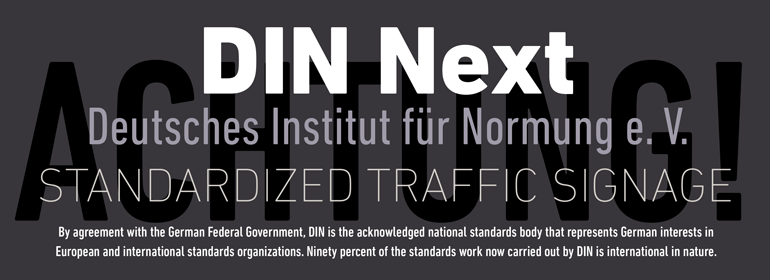
- DIN Next is a typeface family inspired by the classic industrial German engineering designs, DIN 1451 Engschrift and Mittelschrift. Akira Kobayashi began by revising these two faceswho names just mean condensed and regularbefore expanding them into a new family with seven weights (Light to Black). Each weight ships in three varieties: Regular, Italic, and Condensed, bringing the total number of fonts in the DIN Next family to 21. DIN Next is part of Linotypes Platinum Collection. Linotype has been supplying its customers with the two DIN 1451 fonts since 1980. Recently, they have become more popular than ever, with designers regularly asking for additional weights. The abbreviation "DIN" stands for Deutsches Institut für Normung e.V., which is the German Institute for Industrial Standardization. In 1936 the German Standard Committee settled upon DIN 1451 as the standard font for the areas of technology, traffic, administration and business. The design was to be used on German street signs and house numbers. The committee wanted a sans serif, thinking it would be more legible, straightforward, and easy to reproduce. They did not intend for the design to be used for advertisements and other artistically oriented purposes. Nevertheless, because DIN 1451 was seen all over Germany on signs for town names and traffic directions, it became familiar enough to make its way onto the palettes of graphic designers and advertising art directors. The digital version of DIN 1451 would go on to be adopted and used by designers in other countries as well, solidifying its worldwide design reputation. There are many subtle differences in DIN Nexts letters when compared withe DIN 1451 original. These were added by Kobayashi to make the new family even more versatile in 21st-century media. For instance, although DIN 1451s corners are all pointed angles, DIN Next has rounded them all slightly. Even this softening is a nod to part of DIN 1451s past, however. Many of the signs that use DIN 1451 are cut with routers, which cannot make perfect corners; their rounded heads cut rounded corners best. Linotypes DIN 1451 Engschrift and Mittelschrift are certified by the German DIN Institute for use on official signage projects. Since DIN Next is a new design, these applications within Germany are not possible with it. However, DIN Next may be used for any other project, and it may be used for industrial signage in any other country! DIN Next has been tailored especially for graphic designers, but its industrial heritage makes it surprisingly functional in just about any application.


Comments (0)
Be the first to leave a comment. Your opinion is important to us. Thank you!
Add comments