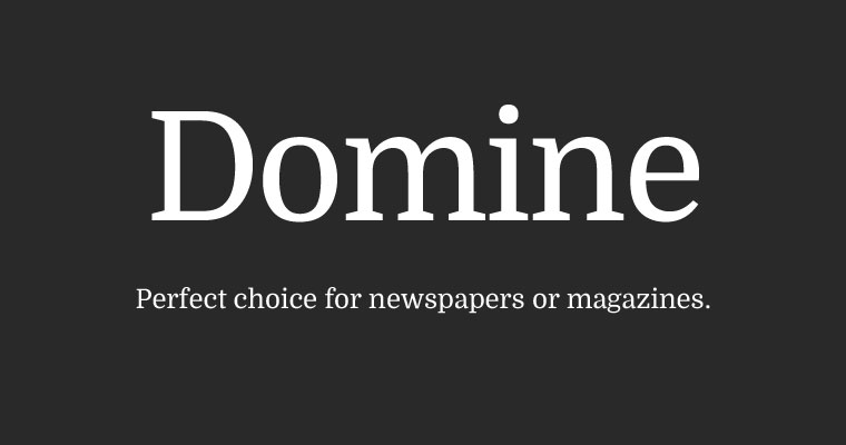
Domine
This font consists of 2 files. The Domine font supports Latin language systems. This font is quite popular. It has 408 views and 4 downloads at the moment. According to preliminary information, the font is "Free font". You use this at your own risk. Check the license type yourself. This font was designed by Impallari Type. Weights: Regular , Bold .
- 408
- 4
- 21.08.2019
- Latin
- Free font
- Impallari Type
- Tags: antiqua, free, google fonts, serif
Categories:
Serif fonts |
Google Fonts
Images
Font file info
We have collected all the most important information about the Domine Regular font.
Below is a table about the font file version, license, copyright, designer and vendor name.
The information is taken from the "TTF" font file.
- Full name
- Domine
- Font family
- Domine
- Font subfamily
- Regular
- Version
- Version 1.000; ttfautohint (v0.93) -l 8 -r 50 -G 200 -x 14 -w "G"
- Trademark
- Domine is a trademark of Pablo Impallari
- Manufacturer
- Pablo Impallari, Rodrigo Fuenzalida, Brenda Gallo
- Designer
- Pablo Impallari, Rodrigo Fuenzalida, Brenda Gallo
- Designer URL
- www.impallari.com
- Vendor URL
- www.impallari.com
- License
- This Font Software is licensed under the SIL Open Font License, Version 1.1. This license is available with a FAQ at: http://scripts.sil.org/OFL
- License URL
- http://scripts.sil.org/OFL
- Copyright
- Copyright (c) 2012, Pablo Impallari (www.impallari.com|impallari@gmail.com), Copyright (c) 2012, Rodrigo Fuenzalida (www.rfuenzalida.com|hello@rfuenzalida.com), Copyright (c) 2012, Brenda Gallo (gbrenda1987@gmail.com), with Reserved Font Name Domine.
- Description
- From the very first steps in the design process 'Domine' was designed, tested and optimized for body text on the web. It shines at 14 and 16 px. And can even be used as small as 11, 12 or 13px. Harmless to the eyes when reading long texts. Domine is a perfect choice for newspapers or magazines websites, where text is the main focus. It's is friendly in appearance because it combines the classic elements of familiar typefaces that have been in use from more than 100 years like Clarendon, Century, Cheltenham and Clearface. - The rounded letters (b, c, d, e, o, p, q) are a bit squarish on the inside. This feature opens up the counters for better rendering and also make it look a bit more up-to-date than the classic typefaces previously referenced. - The serifs are a bit shorter than usual. Another feature that improves the rendering by allowing more "air" between each letter pair. - The joins of the stems to the branches in letters like h, m, n are deep enough to prevent dark spots, also improving legibility at small sizes. - The friendly lowercase 'a', with the curve starting from the bottom of the stem, is reminiscent of Cheltenham and Clearface. That soft curve is also echoed in the curves of the f, j, n, m and r. - The spacing is also optimized for body text on the web, clearly more open than that of typefaces made for print or for headlines.

Comments (0)
Be the first to leave a comment. Your opinion is important to us. Thank you!
Add comments