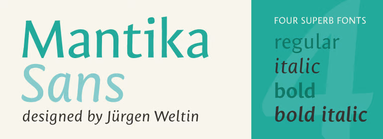
Mantika Sans Pro
This font is called Mantika Sans Pro, which contains 4 weights. It supports Cyrillic and Latin languages This font is quite popular. It has 384 views and 14 downloads at the moment. The typeface is probably "Paid font". Be sure to check the license type yourself before using. Available fonts: Regular , Italic , Bold , Bold Italic .
- 384
- 14
- 17.11.2022
- Cyrillic, Latin
- Paid font
- Tags: sans, sans-serif, web
Categories:
Sans serif fonts
Font Articles
Images
Font file info
We have collected all the most important information about the Mantika Sans Pro Regular font.
Below is a table about the font file version, license, copyright, designer and vendor name.
The information is taken from the "TTF" font file.
- Full name
- ☞MantikaSansProCYR-Regular
- Font family
- MantikaSansProCYR-Regular
- Font subfamily
- ☞
- Version
- Version 1.00;com.myfonts.linotype.mantika-sans.pro-cyrillic-regular.wfkit2.3Kob
- Trademark
- Mantika is a trademark of Linotype Corp. and may be registered in certain jurisdictions in the name of Linotype Corp. or its licensee Linotype GmbH.
- Manufacturer
- Linotype GmbH
- Designer
- Jürgen Weltin
- Designer URL
- http://www.linotype.com/fontdesigners
- Vendor URL
- http://www.linotype.com
- Copyright
- Copyright © 2011 Linotype Corp., www.linotype.com. All rights reserved. This font software may not be reproduced, modified, disclosed or transferred without the express written approval of Linotype Corp. Mantika is a trademark of Linotype Corp. and may be registered in certain jurisdictions in the name of Linotype Corp. or its licensee Linotype GmbH. This typeface is original artwork of Jürgen Weltin. The design may be protected in certain jurisdictions.
- Description
- Die Ursprünge der Mantika Sans gehen zurück auf eine im Jahr 2000 entworfene Serifenschrift, wie man am Strichwechselkontrast der neuen Serifenlosen gut erkennen kann. Aus den Anforderungen an eine gut lesbare Schrift eines nicht realisierten Projekts für die Untertitelung auf TV-Bildschirmen, entstand aus den ursprünglichen Antiqua-Formen heraus eine serifenlose Schrift mit großer Kleinbuchstabenhöhe, die gerade in kleinen Größen gut zu lesen ist. Die Mantika Sans wirkt kompakt sowohl in ihrer vertikalen Ausdehnung, aufgrund der relativ kleinen Versalien und den eher kurzen Ober- und Unterlängen, als auch im horizontalen Zeilenbild mit ihren schmalen Proportionen. Deutliche Unterscheidungen der Buchstaben wie zum Beispiel bei I, i und l fördern nicht nur die Lesbarkeit auf Bildschirmen. Die vier Schnitte der Mantika Sans eignen sich deshalb besonders auch für den Office-Bereich oder für die Gestaltung von Geschäftsberichten, mit ihrem weiteren Merkmal der kleinen Versalziffern, die deutlich kleiner als die Versalien sind und somit im fortlaufenden Text nicht unangenehm auffallen. Die fast aufrechte Kursive mit nur 4,5° Neigung hat ganz eigenständige Formen, so dass sie sich deutlich als Auszeichnungsschrift hervorhebt, aber auch alleine als eine angenehme Textschrift für längere Passagen dienen kann. Diese konzeptionellen Eigenschaften ermöglichten es, die vier zusammenhängenden Schnitte der Mantika Sans dicktengleich zu halten, so dass ein Wechsel der Schriftart im Layout den Satzumbruch nicht ändert. Der Zeichenumfang der Mantika Sans ist paneuropäisch angelegt, mit Unterstützung von Griechisch und Kyrillisch. Desweiteren ist sie mit vielen nützlichen Sonderzeichen ausgestattet, wie etwa spitze Klammern, hoch- und tiefgestellte Kleinbuchstaben und Ziffern, Pfeile und Aufzählungszeichen.


Comments (0)
Be the first to leave a comment. Your opinion is important to us. Thank you!
Add comments