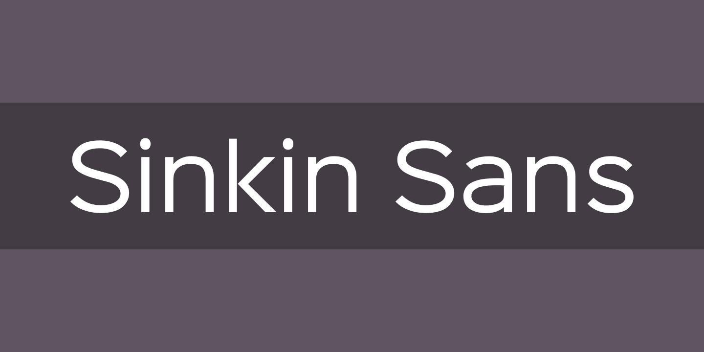
Sinkin Sans
This font consists of 18 files. The Sinkin Sans font supports Latin language systems. This font is quite popular. It has 526 views and 20 downloads at the moment. According to preliminary information, the font is "Free font". You use this at your own risk. Check the license type yourself. This font was designed by K-Type. Weights: 100 Thin , 100 Thin Italic , 200 XLight , 200 XLight Italic , 300 Light , 300 Light Italic , 400 Italic , 400 Regular , 500 Medium , 500 Medium Italic , 600 SemiBold , 600 SemiBold Italic , 700 Bold , 700 Bold Italic , 800 Black , 800 Black Italic , 900 XBlack , 900 XBlack Italic .
- 526
- 20
- 22.05.2023
- Latin
- Free font
- K-Type
- Tags: sans, sans-serif, web
Font Articles
Images
Font file info
We have collected all the most important information about the Sinkin Sans 400 Regular font.
Below is a table about the font file version, license, copyright, designer and vendor name.
The information is taken from the "TTF" font file.
- Full name
- Sinkin Sans 400 Regular
- Font family
- Sinkin Sans 400 Regular
- Preferred subfamily
- 400 Regular
- Font subfamily
- Regular
- Version
- Sinkin Sans (version 1.0) by Keith Bates • © 2014 www.k-type.com
- Trademark
- Sinkin Sans is a trademark of K-Type
- Manufacturer
- K-Type
- Designer
- Keith Bates
- Vendor URL
- www.k-type.com
- License
- All weights of SINKIN SANS are totally free for commercial and personal use as desktop and web fonts. You can freely distribute and modify SINKIN SANS provided the original copyright and license information, and details of any modifications, are included. SINKIN SANS is gifted 'as is', without warranty. SINKIN SANS is a trademark of K-Type. Licensed under the Apache License, Version 2.0
- License URL
- http://www.apache.org/licenses/LICENSE-2.0.html
- Copyright
- Sinkin Sans 400 Regular by Keith Bates • © 2014 www.k-type.com • Sinkin Sans is a simple, pleasantly proportioned sans serif with tiny, inconspicuous notches that sink into vertical strokes adding highlights to congested corners.
- Description
- The incisions make right angles appear sharper and improve definition in more intricate glyphs. Although the nicks are barely noticeable they add emphasis to outlines and give a lift to shady nooks.

Comments (0)
Be the first to leave a comment. Your opinion is important to us. Thank you!
Add comments